Physical Address
304 North Cardinal St.
Dorchester Center, MA 02124
Physical Address
304 North Cardinal St.
Dorchester Center, MA 02124
Technical Analysis as part of my daily take on the WTI crude oil market.
Less = more
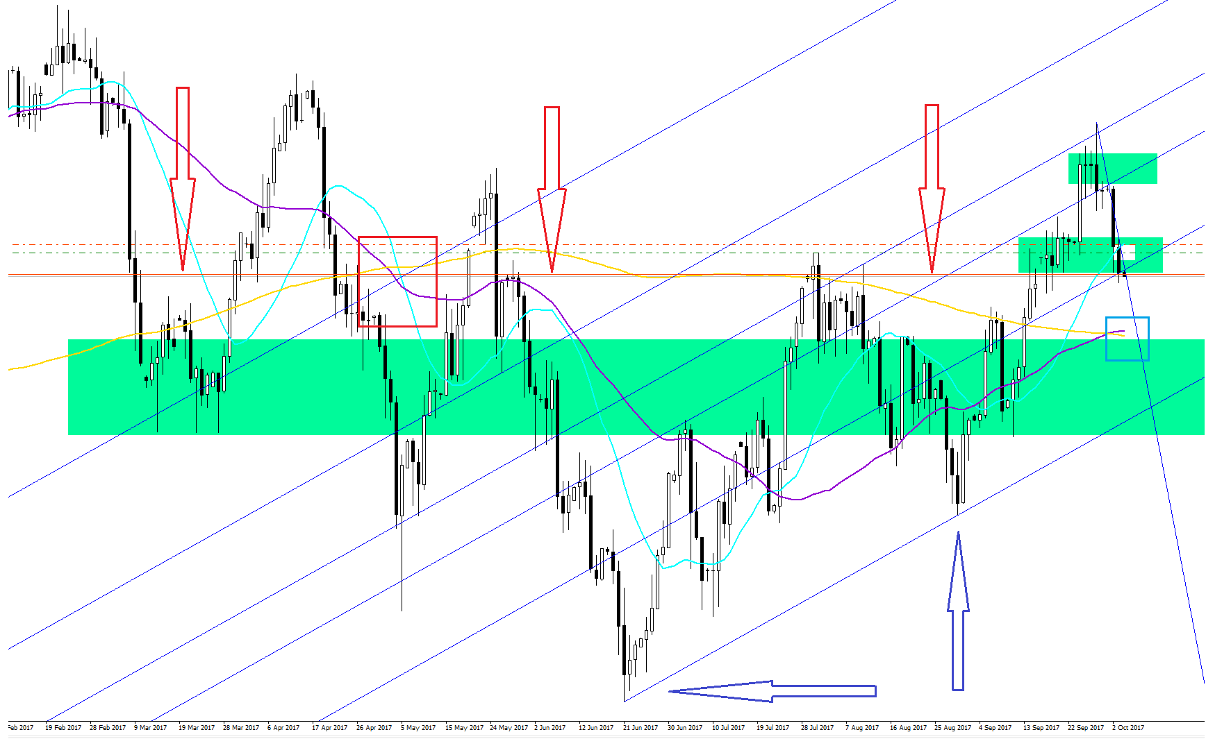
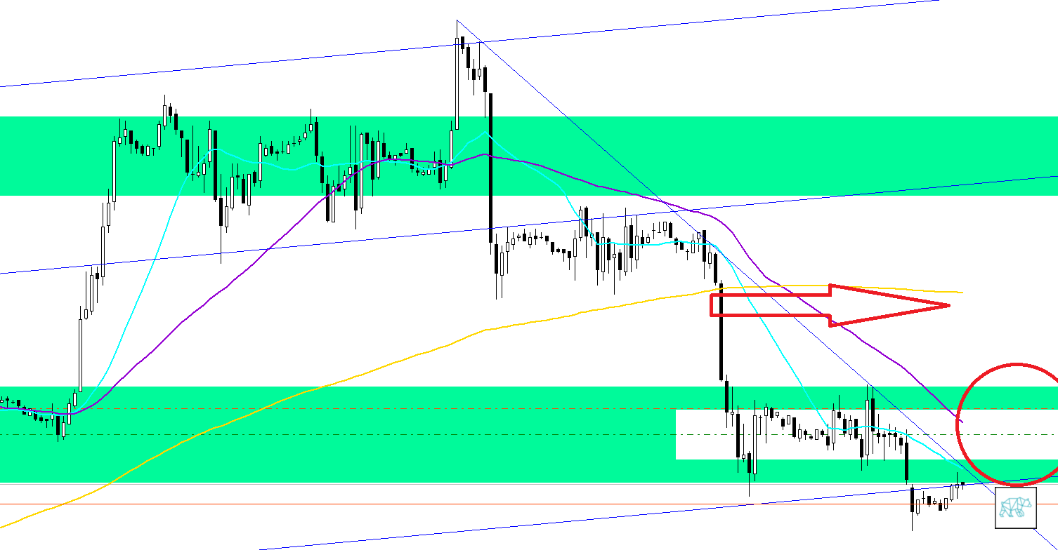
To start with underneath we can see the Daily chart. On this chart I have plotted a few things that I think will help me better understand the ‘pressure points’ of the market. I used to crowd my charts with so many indicators and ‘art’ thrown on there. Then I realized that it was just me trying to force my will onto the markets, which is futile. It is my ‘philosophy’ at this time (until I give up and call it the big randomness of trading and start using a dice) that price action is like a form of energy. Energy that builds up into a corner and then the pressure builds up too much and we have a break out. I am not convinced (yet) that we can accurately measure which way there is a higher probability of a break out. However, If I do find out at some point? Sure as hell won’t share that with you! Unless you say ‘pretty please?!’ If you are at a loss of some of the terms in this article, unless otherwise indicated, you can just go out and google them.
Extras! Extras! Get your news here! Only 25 cents!
Most people on news outlets and forums scream a lot of things and like gambling when it comes to trading they are sometimes right. Take me. I said prices would reverse for a pullback which they now did but I was so wrong on the timing. I hope I’ll get better at timing these things. My point is that most people shout something and wait for it to happen and call themselves a genius for their predictions. I understand that if it’s your job you are caught up in this cycle of ‘pretend analytical journalism’. Don’t even wanna talk about all the others. I understand that the general public is not waiting for a ‘it might go that way, it might not’ kind of news. They crave absolute answers but don’t realize it’s in the form of entertainment worth less than 25 cents. I don’t have anyone to lie for. I can be just as objective as my own fallacies lead me to believe 🙂 Take this whichever way you want.
SRA
Let’s start with the most obvious ones. The big green rectangles. I plot these on the charts to help me identify where I think the support and resistance areas (SRA) are. There’s a big one and then I have smaller ones. I believe these SRA function as a sort of attraction point to prices because of the density.
MA
Then I have the Aqua blu 20 simple moving average, the Violet purple 50 simple moving average and the Gold 200 simple moving average. I have these because I plot my calculations on the assumption that prices move away and to the moving averages (even though they are the result of price action and not price action the result of them). These moving averages give us a simpler way of visualizing the direction of the markets. When we look at the red square we can see that all moving averages crossed at that point in time. The faster 20 SMA crossed down the 50 and 200 SMA. The 50 SMA crossed down on the 200SMA. This to me is a very bearish sign and as you can see prices have been in a downtrend since until lately where it broke this trend. Now we are in a bit of a ‘twilight zone’ and are not sure what way things will go from here. Moving averages are lagging indicators so the challenge of using them to calculate probability is a bit well… lagging. In the blue square on the right we can see that the 20 SMA has already crossed over the 50 and 200 SMA and the 50 has just crossed the 200 sma. This ‘premature’ crossing of the 20 SMA (as opposed of the crossing of the 50 and 200 SMA) might be an indicator that we haven’t fully turned the trend into a bullish one yet. We’ll probably see prices go a bit up and then return to this same level or even lower before prices decide to go on a confirmed bullish trend.
Fib. Channel
The diagonal lines are plotted with the Fibonacci channel tool. If you don’t know Fibonacci and you’re trying to trade, good luck to you. Go on and Google. The two big blue arrows indicated to which points in the chart I plotted the Fib. channel tool. This then gave me diagonal trend lines based on Fib. sequences that do a pretty damn good job of indicating the bounds of price action. We’ll get to the red arrows later.
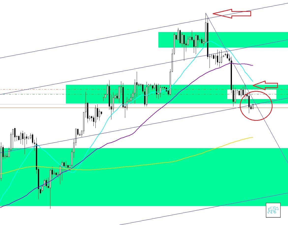
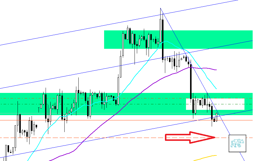
This is the 4H chart where we can see a few things. I have drawn a diagonal line across the top and bottom of where prices retreated back to indicated by the red arrows. This diagonal line intersects with the Fib. channel lines at the center of the red circle. I believe that this is one of those pressure points I mentioned earlier. This is the point that I believe we will see a significant move either up or down. Let’s look at the other indicators.
Simply Moving Averagely
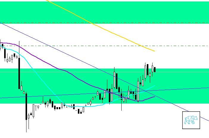
This simple moving averages here tell us the following. The blue 20 SMA has crossed under the purple 50 SMA. Both are pointing downwards indicating a downwards pressure on prices for the moment. Furthermore, they have been moving away from the 200 sma which would indicate prices to retract to it as well. Translation, another indicator for more downwards pressure. Like I said earlier, moving averages are lagging indicators but they do give us a ‘feel’ for the direction. I am in no way saying that this is an exact science. What I am trying to do with this is to give myself a bias for the market and time frame I want to trade in. Based on this bias I can work my strategies.
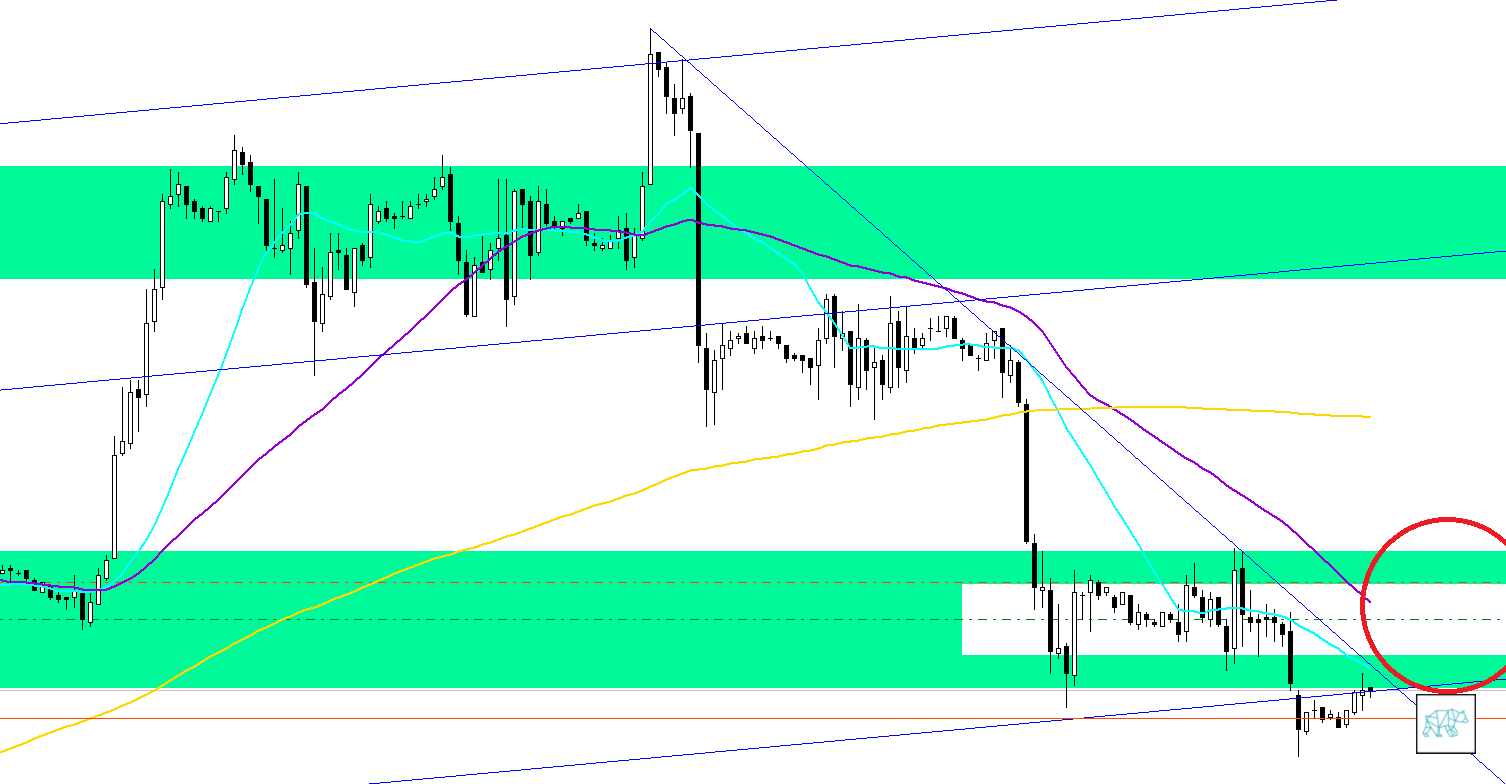
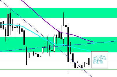
This is the 1H chart that we’re looking at get a closer look and perhaps a better understanding. If we use the attracting and repelling nature of moving averages as our premise. On top of this some ‘common sense’ that when prices go down in a fairly steep way to tend the go back up the same way at least for a while. This is more apparent on the bigger time frame just go and look back. Do you like the way I interjected ‘common sense’ there? 🙂 By this I merely refer to the ‘gut feeling’ you develop when actively observing the markets. I am not saying that I am right of course. It’s just a ‘feeling’. Like I said time and time again. I just look for these pressure points and let the magic happen. If prices don’t go towards that red circle. Than they are most likely to continue their drop down.
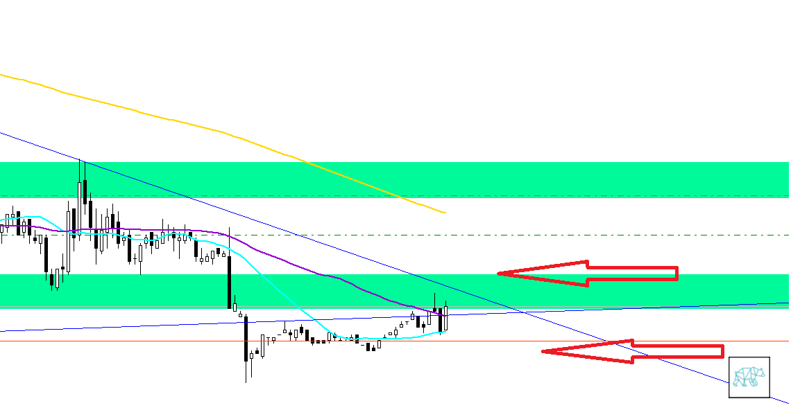
I will wait for prices to touch and close on the level of the red arrows to get ready to enter. Then enter when the next candle closes into that direction.
On the long side I would aim for exiting around the level of the red arrow. Below we see where I would exit on the short side.
As I am finishing up writing this article we can see that prices have climbed higher so pressure is building up in the apex of this triangle. Let’s see what happens afterwards. I will update this article with the results of any trades taken etc.
In the aftermath part of this article I will reflect, if you will, on my analysis I wrote above. What did I do write? What did I do wrong kind of thing. So let’s take a look at the chart in the ‘aftermath’ of breaking out of the pressure point.
If you look at the part above where I said that if prices would break off to the upside it would go there where it has gone now. A quick pat on the back and off in distant memory it goes. Don’t linger on past successes and losses. Won’t do you any good.
 What happened afterwards is definitely a lesson for me. Let’s take a look. We can see here that indeed the prices went up, like thought of before. Straight up through the apex of the pressure point. Stayed above the horizontal blue trend line. Made his way up through the green and white SRA, to ‘touch’ the upper part of the green SRA. Then it just went straight down, broke through the horizontal blue trendline, but kind of ‘obeyed’ the diagonal blue trend line. This is definitely a bearish move. I will have to get back to the ‘drawing board’ and ‘see’ what will happen next.
Please leave a comment and tell me I’m an idiot with my pressure points etc. Go on! You know u want to!